
Your First Analysis#
This tutorial walks through a complete GuPPy pipeline run from raw CSV data to a PSTH plot. You will use the small sample dataset that lives inside the GuPPy repository (under Git LFS), so the only setup is the source-install steps below.
By the end you will have:
Launched the GuPPy GUI
Selected your data and reviewed the analysis parameters
Labeled your channels with storenames
Loaded the raw data into HDF5
Preprocessed the signal
Computed the PSTH
Visualized the results
Prerequisites#
GuPPy installed from source, with Git LFS. This tutorial uses sample CSV files that live in the GuPPy repository under
stubbed_testing_data/csv/sample_data_csv_1/, which is tracked by Git LFS. A plaingit clonewill fetch only LFS pointer files (a few hundred bytes each) instead of the real CSVs, so you need both Git LFS installed on your machine and a clone with the relevant LFS payload pulled in:# Install Git LFS once per machine; see https://git-lfs.com for OS-specific instructions. git lfs install git clone https://github.com/LernerLab/GuPPy.git cd GuPPy git lfs pull --include="stubbed_testing_data/csv/sample_data_csv_1/*" pip install -e .
See the README for the full installation guide, including how to set up a conda environment first. The plain
pip install guppy-neuropath also works for installing the GUI itself, but you would still need to clone the repo (with Git LFS) separately to access the sample data.The sample data lives at
stubbed_testing_data/csv/sample_data_csv_1/inside the cloned repository. It contains three CSV files:File
Description
Sample_Control_Channel.csvIsosbestic (405 nm) control channel
Sample_Signal_Channel.csvCalcium-dependent (470 nm) signal channel
Sample_TTL.csvEvent timestamps
Each signal CSV has three columns:
timestamps(seconds),data(fluorescence), andsampling_rate. The TTL CSV has a singletimestampscolumn.
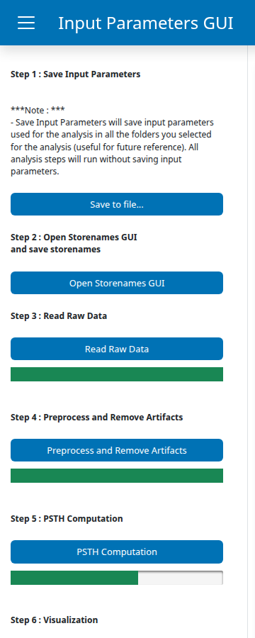
Step 0: Launch the GuPPy GUI#
guppy
A browser tab opens showing the GuPPy dashboard.
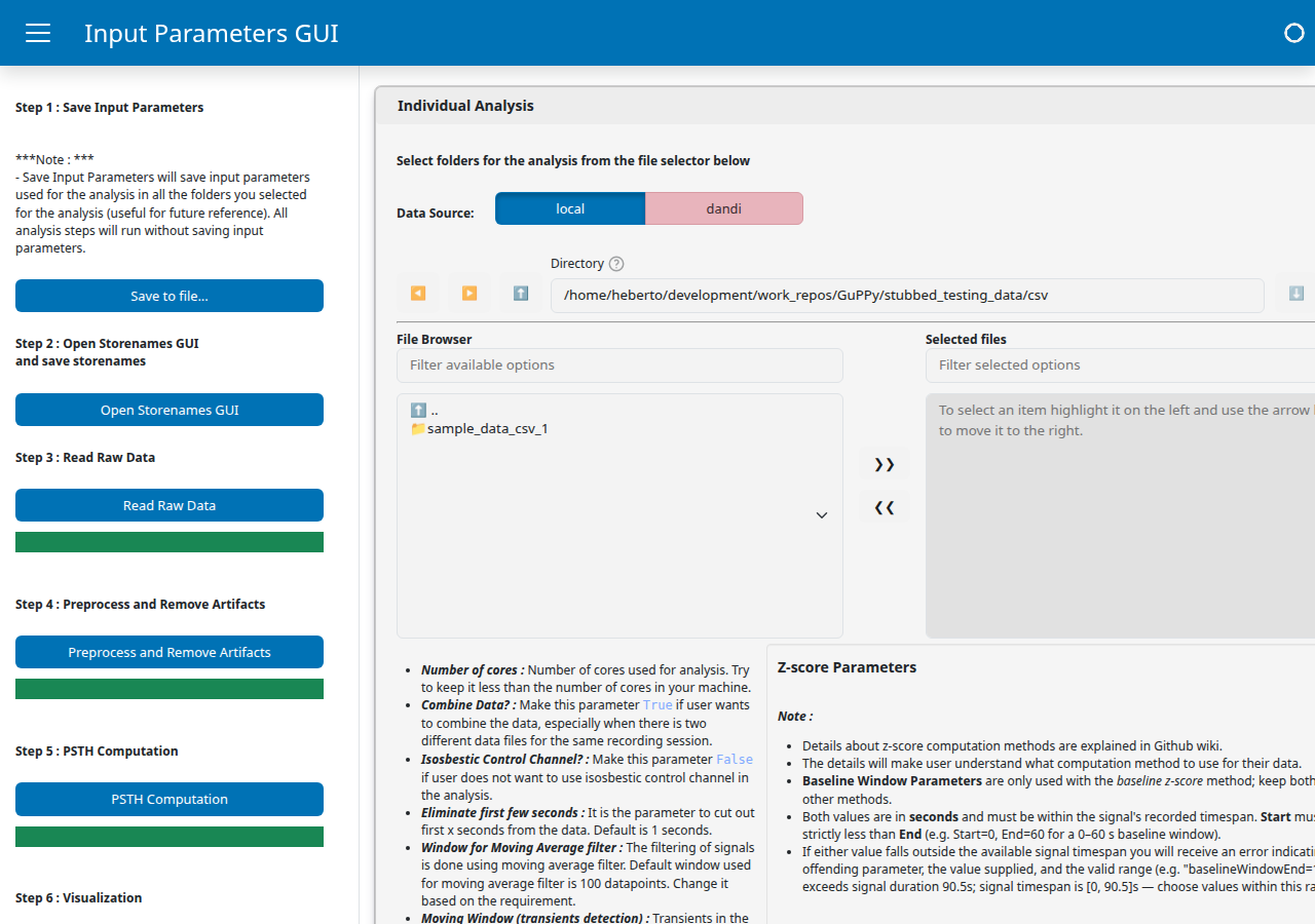
The page is split into a sidebar on the left and a main area on the right. The sidebar lists the pipeline buttons in run order, from Save Input Parameters at the top through Visualization at the bottom, with a progress bar directly under each step that performs background work. The main area is where you select your data folder and configure parameters; settings are grouped into three collapsible cards: Individual Analysis (the only one we use in this tutorial), Group Analysis, and Visualization Parameters. The “Step N” labels in the sidebar match the step numbering used in the rest of this tutorial.
Step 1: Select your data and set parameters#
This step has two parts. You will pick the session folder you want to analyze, then look over (but not change) the analysis parameters that the rest of the pipeline will use.
Select your data#
Inside the Individual Analysis card, use the file browser at the top of the card to navigate to stubbed_testing_data/csv/sample_data_csv_1/. Click >> to move that folder into the Selected files pane on the right. The card supports selecting multiple session folders at once for batch analysis; for this tutorial we are running a single session.
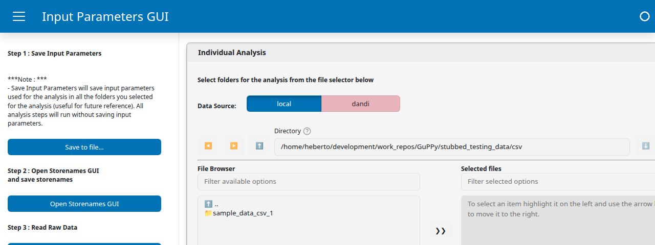
The Data Source toggle at the top lets you switch between local (the default, file-system browsing) and dandi (streaming NWB sessions directly from DANDI). We are using local files here.
Set parameters#
Below the file browser, the same Individual Analysis card lists the parameters that drive the rest of the pipeline. For this tutorial the defaults are fine, so you do not need to change anything; the screenshot below is for orientation, not for hunting and clicking.
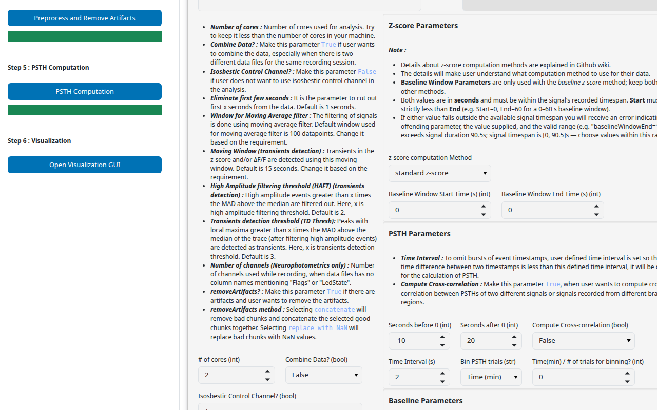
Each parameter is documented in the parameter reference.
Step 2: Label your channels#
A storename is the human-readable label GuPPy uses for one of your data channels. Raw acquisition files come with cryptic, format-specific names (here, the CSV filenames Sample_Control_Channel, Sample_Signal_Channel, Sample_TTL); GuPPy needs you to map each one to a meaningful name like control_A, signal_A, or RewardPort. Those mapped names are what every downstream step (preprocessing, PSTH, plots, group analysis) refers to. The mapping is saved as storesList.csv inside an output folder created next to the session.
Click Open Storenames GUI in the sidebar. A new browser tab opens with the Storenames panel for the selected folder.
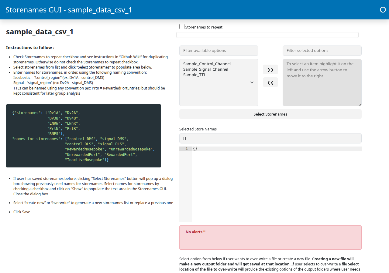
The three CSV filenames appear in the left list (Filter available options) of the Store Names Selection widget. Walk through these substeps:
Move all three channels to the right list. Click each of
Sample_Control_Channel,Sample_Signal_Channel,Sample_TTLin the left list and use the>>button to move it to the right. (Or shift-click to select all three at once before clicking>>.)Click “Select Storenames”. A new Configure Storenames section appears below, with one row per channel. Each row has a Type dropdown and a Name text field.
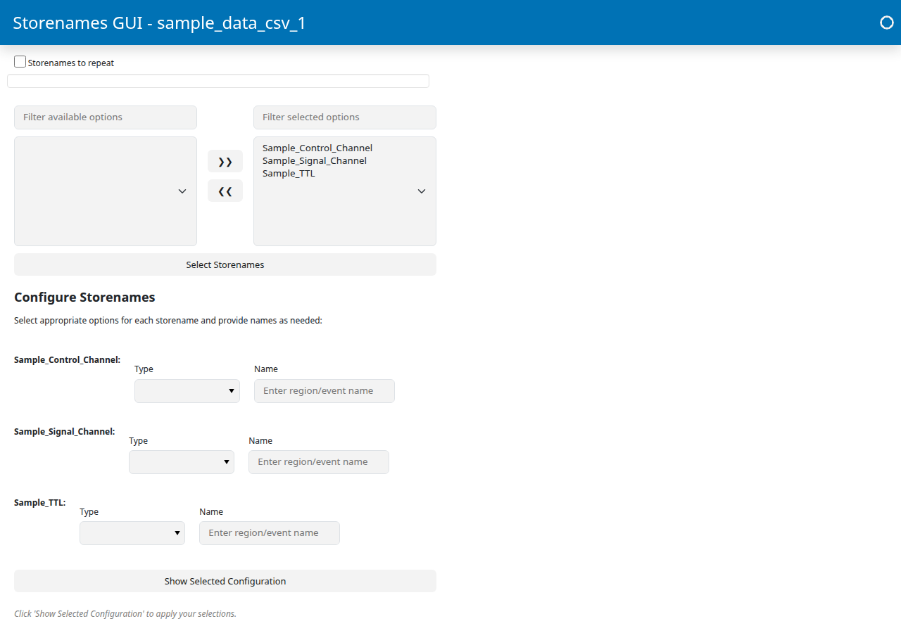
Fill out one row per channel. The Name field is a brain region identifier, not a description of the channel’s role. The control and signal rows must use the same Name because GuPPy uses that match to pair the isosbestic (405 nm) control trace with the calcium-dependent (470 nm) signal trace from the same fiber, then fits and subtracts one from the other during preprocessing to remove motion artifacts and photobleaching. In a multi-fiber recording, each fiber gets its own identifier (e.g.
DMS,DLS) so each control is paired with its own signal. In this single-fiber tutorial we useA. The event TTL row uses a free-form event name instead.Channel
Type
Name
Sample_Control_ChannelcontrolASample_Signal_ChannelsignalASample_TTLevent TTLsRewardPortGuPPy combines the dropdown and text field into the final storename:
control+Abecomescontrol_A,signal+Abecomessignal_A, and the event TTL keeps the name as-is (RewardPort). If the control and signal Name fields differ, saving will fail withMismatched signal/control region pairs — Every 'signal_<region>' must have a matching 'control_<region>'.Click “Show Selected Configuration”. This applies your row entries to the JSON editor below, which should now read something like:
{
  "Sample_Control_Channel": ["control_A"],
  "Sample_Signal_Channel": ["signal_A"],
  "Sample_TTL": ["RewardPort"]
}
Choose the output directory. Use the over-write storeslist file or create a new one? menu button and select
create_new_file.Despite the menu’s name, this choice does more than name a file. It picks the output directory for the entire analysis pipeline. From this point on, every downstream step (Read Raw Data, Preprocess, PSTH Computation, Visualization) writes its outputs (HDF5 files, PSTH results, plots) into that directory and reads
storesList.csvfrom it to know which raw channel maps to which storename.create_new_filemakes a fresh subdirectory inside the session folder, named<session>_output_<N>/with<N>auto-incremented (_output_1on the first run,_output_2on the second, and so on).Note
The other menu option,
over_write_file, is for re-running on a session that already has an output subdirectory. It lets you point at an existing<session>_output_<N>/, deletes everything inside it (the previousstoresList.csvplus any HDF5 and PSTH results from the previous run), and starts that subdirectory over fresh. Pickover_write_fileonly when you genuinely want that destructive behavior. For the tutorial, ignore it.Click Save. GuPPy creates the output subdirectory (e.g.
sample_data_csv_1_output_1/) and writesstoresList.csvinto it. The downstream steps will read and write inside this folder.
You can close this Storenames tab and return to the original homepage tab to continue.
Step 3: Load the raw data#
Click Read Raw Data. A progress bar appears in the sidebar directly below the button and fills as the work runs. That bar is the primary signal that the step is in progress.
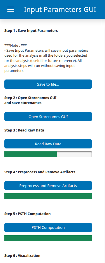
The other bars on the sidebar (under Preprocess and Remove Artifacts and PSTH Computation) appear pre-filled at 100% as a styling default; they reset to 0 and fill while their own step is running. So a fully-green bar does not mean that step is done, it just means it has not been touched yet.
GuPPy loads each CSV file and writes the data into the output folder you created in Step 2, one HDF5 file per storename (so for this tutorial: sample_data_csv_1_output_1/control_A.hdf5, .../signal_A.hdf5, .../RewardPort.hdf5). Each file holds the channel’s data, timestamps, and sampling_rate datasets plus a few metadata fields. HDF5 is a binary format that stores large numerical arrays efficiently and supports partial reads, which speeds up the later pipeline steps.
When the progress bar reaches 100% the step is complete. Confirmation messages are also logged to the terminal where you launched guppy.
Step 4: Preprocess the signal#
Click Preprocess. As with Read Raw Data, a progress bar appears in the sidebar directly below the button and fills as the work runs.

GuPPy runs the following on the raw signal:
Trims the first few seconds from both channels (the Eliminate first few seconds parameter, internally
timeForLightsTurnOn).Applies a moving-average filter to reduce high-frequency noise (the Window for Moving Average filter parameter, internally
filter_window).Fits the control channel to the signal channel using a linear regression, then subtracts it. This removes motion artifacts and photobleaching that affect both channels equally.
Computes the z-score and the dF/F (delta F over F) of the corrected signal.
The results are written into the same output folder as Step 3, in four new HDF5 files per region. You do not choose the location or the file names; they follow a fixed convention:
File |
Contents |
|---|---|
|
The z-scored trace |
|
The dF/F trace |
|
The fitted control trace (used internally and for artifact-removal plots) |
|
Corrected timestamps, sampling rate, and a few related metadata fields |
When preprocessing finishes, GuPPy opens a matplotlib window showing the preprocessed trace plotted against time. The default is the z-score; the plot_zScore_dff input parameter controls this and can be set to dff or Both instead. Close the matplotlib window to return control to the GUI.
Step 5: Compute the PSTH#
Click Compute PSTH. As with the previous two steps, a progress bar appears in the sidebar directly below the button and fills as the work runs.
GuPPy aligns the z-scored trace to each event timestamp in Sample_TTL.csv, extracts the window defined by the Seconds before 0 / Seconds after 0 parameters (internally nSecPrev, nSecPost) around each event, and averages across all trials. The result is a peri-stimulus time histogram (PSTH).
The default window is -10 to +20 seconds. With the sample data you will get a small number of trials (the TTL file has just a handful of timestamps), so the average will be noisy. This is expected for a minimal example dataset.
The outputs land in the same sample_data_csv_1_output_1/ directory you have been using since Step 2, with one set of files per (event, region) pair. For this tutorial that is the single pair (RewardPort, A):
File |
Contents |
|---|---|
|
The peri-event timestamps (the x-axis of the PSTH) |
|
The PSTH dataframe: one column per trial, plus |
|
Same dataframe before baseline correction was applied (kept for inspection) |
|
Peak amplitude and area-under-curve for the trial-mean PSTH |
The visualization step in Step 6 reads these files; you do not need to inspect them by hand.
Step 6: Visualize the results#
Back on the homepage, expand the Visualization Parameters card. Leave both settings at their defaults: z-score or ΔF/F? stays at z_score (the metric we computed in Step 4), and Visualize Average Results? stays at False. The latter is a group-analysis feature for averaging across multiple sessions and requires Average Group? to have been enabled during PSTH computation; we have a single session, so it does not apply here.
Click Open Visualization GUI in the sidebar. A new browser tab opens with the Visualization GUI for this session, organized into two tabs.
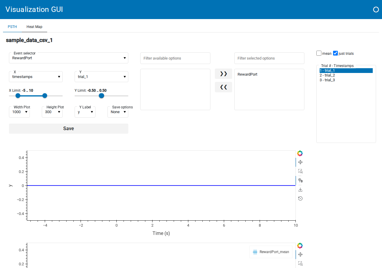
The PSTH tab is the default view. It shows the trial-aligned trace for one event with controls running down the left:
Event selector: which TTL channel to align to (here
RewardPort).X and Y dropdowns: what to plot on each axis. X is typically
timestamps, Y can bemean(the trial average) or an individual trial liketrial_1.X Limit and Y Limit range sliders: restrict the displayed window.
Width Plot, Height Plot, Y Label, Save options dropdowns and a Save PSTH button: figure dimensions and export.
On the right is a trial multi-select (Trial # - Timestamps) and a Select mean and/or just trials checkbox group, which together let you overlay any combination of individual trials and the mean. With a TTL file containing only a handful of timestamps, the average will be noisy; this is expected for the minimal sample dataset.
The Heat Map tab shows trials stacked vertically with colour encoding the metric, which is the better view for inspecting trial-to-trial variability. Its controls mirror the PSTH tab: event selector, Color map (plasma, viridis, …), width and height, save options, and a trial picker.
For this tutorial, the goal is just to reach a rendered PSTH; feel free to play with the controls. A deeper walkthrough of the visualization options will live in an upcoming how-to guide.
Next steps#
See How-to Guides for task-specific instructions (TDT data ingestion, artifact removal, group analysis, etc.).
See Explanation for background on the isosbestic correction and z-score methods.